Tutor
This was formerly a submission to a UI brief contest hosted on Instagram by modernbrief and joelledesigner. The app was previously named "Mentor". There may be references to that name in this case study, but the app is still the same.
Timeline
2 weeks
Role
UI DESIGN
Tools Used
Figma, Affinity Designer
Demo
No preview available
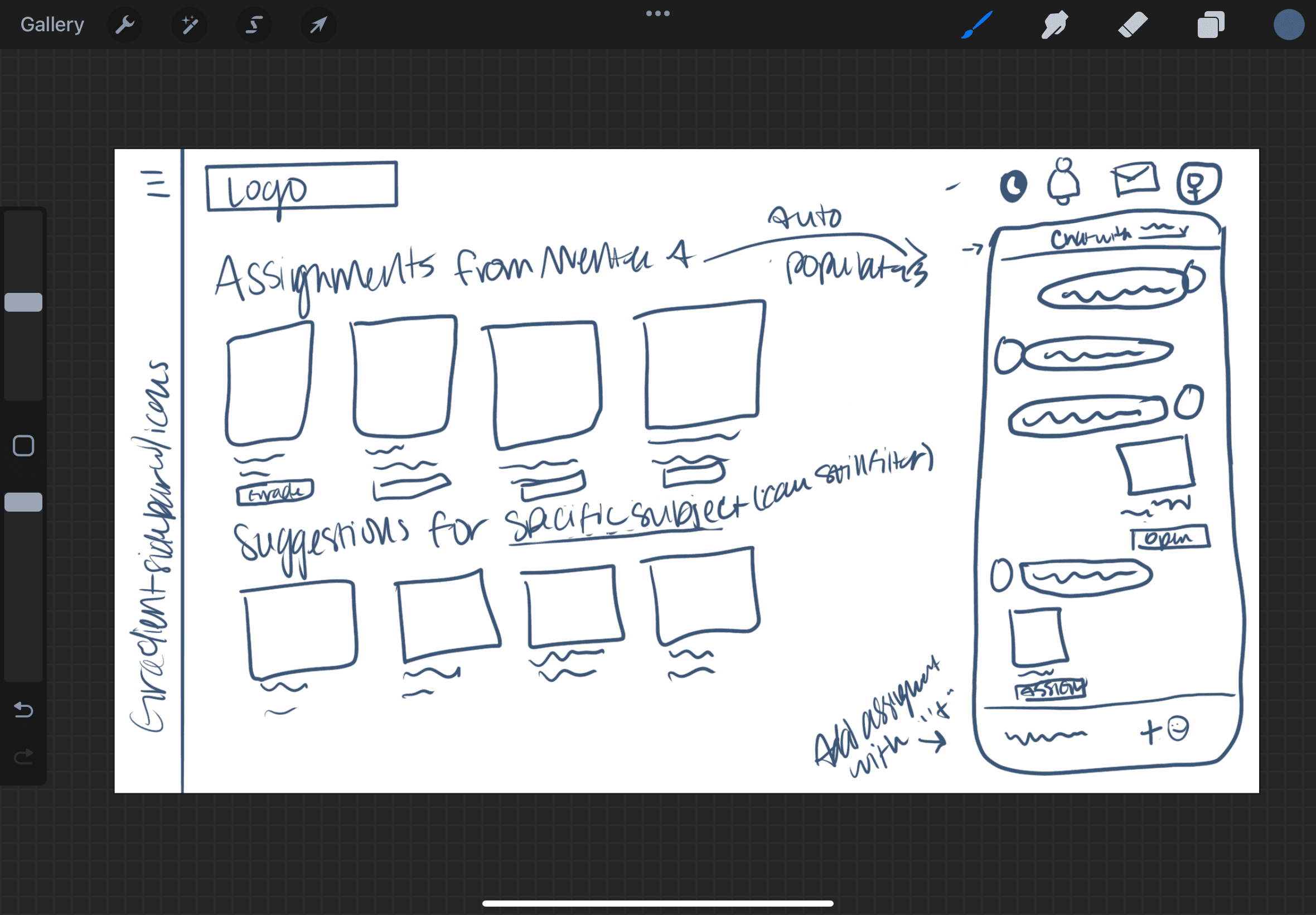
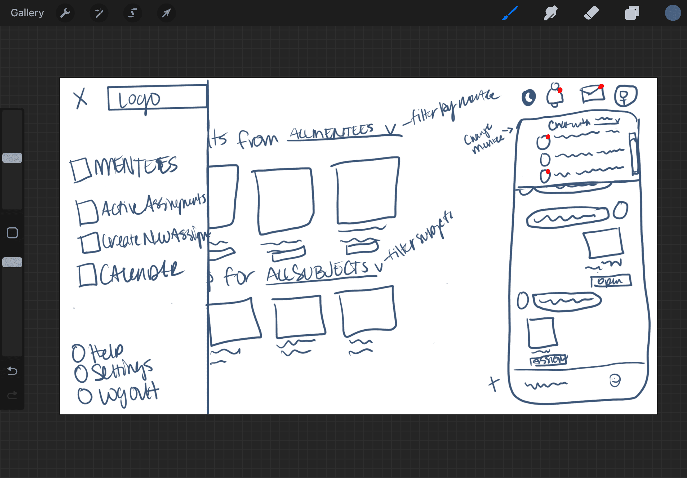
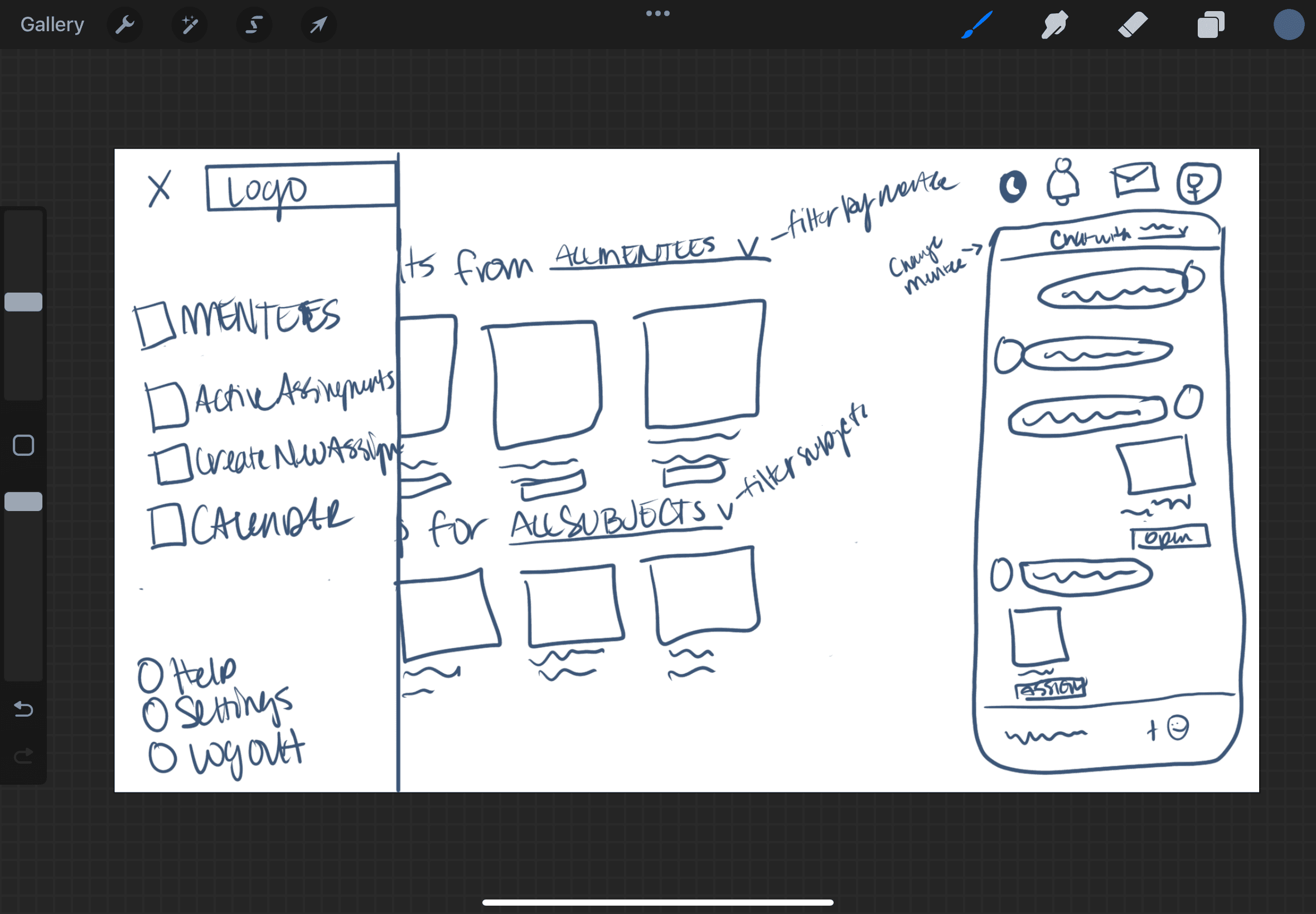
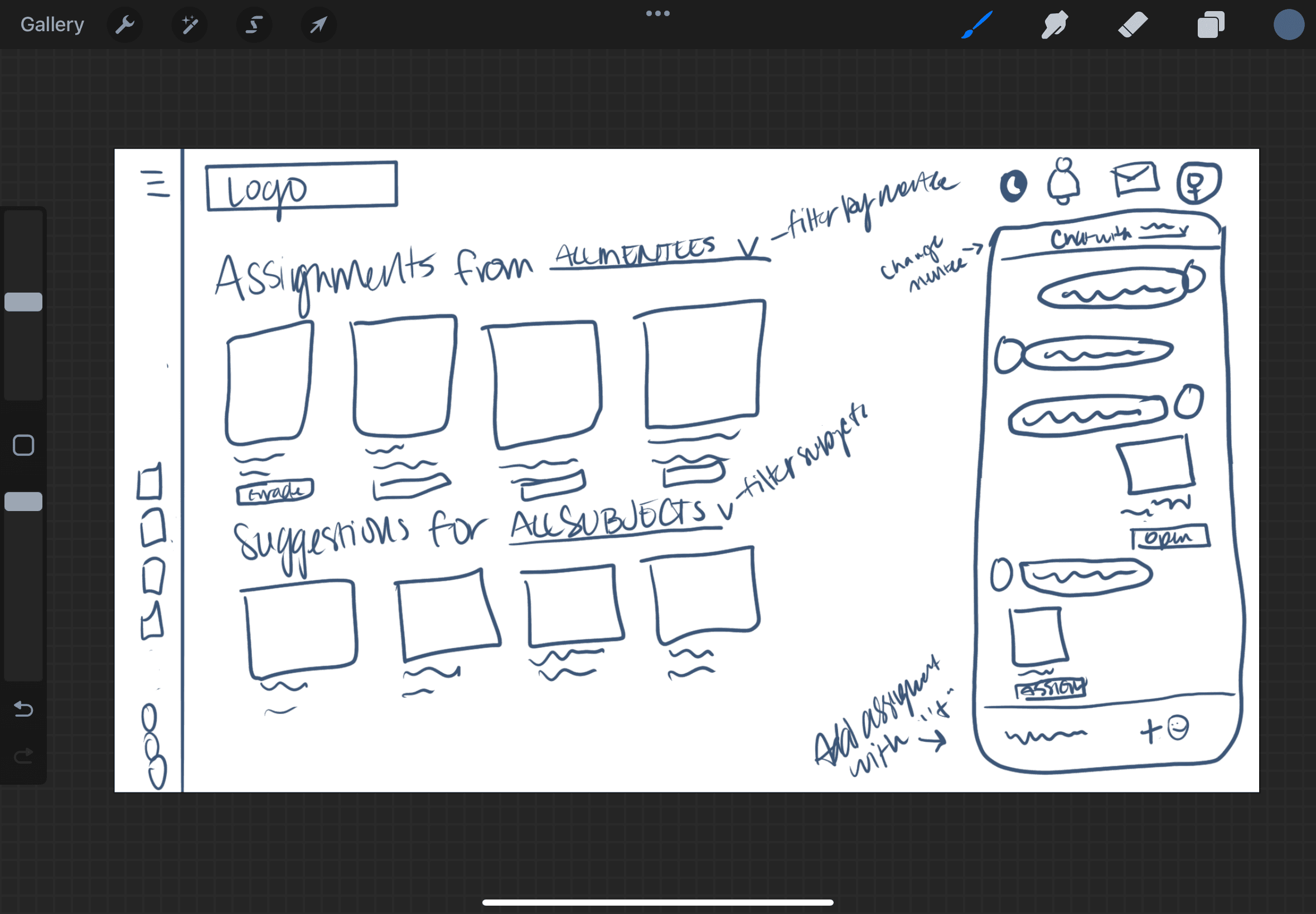
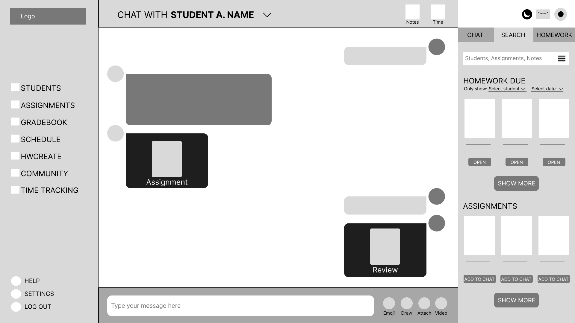
Tutors currently communicate with their students via a chat but they’ve found it difficult to send files and also mark assignments through the chat.
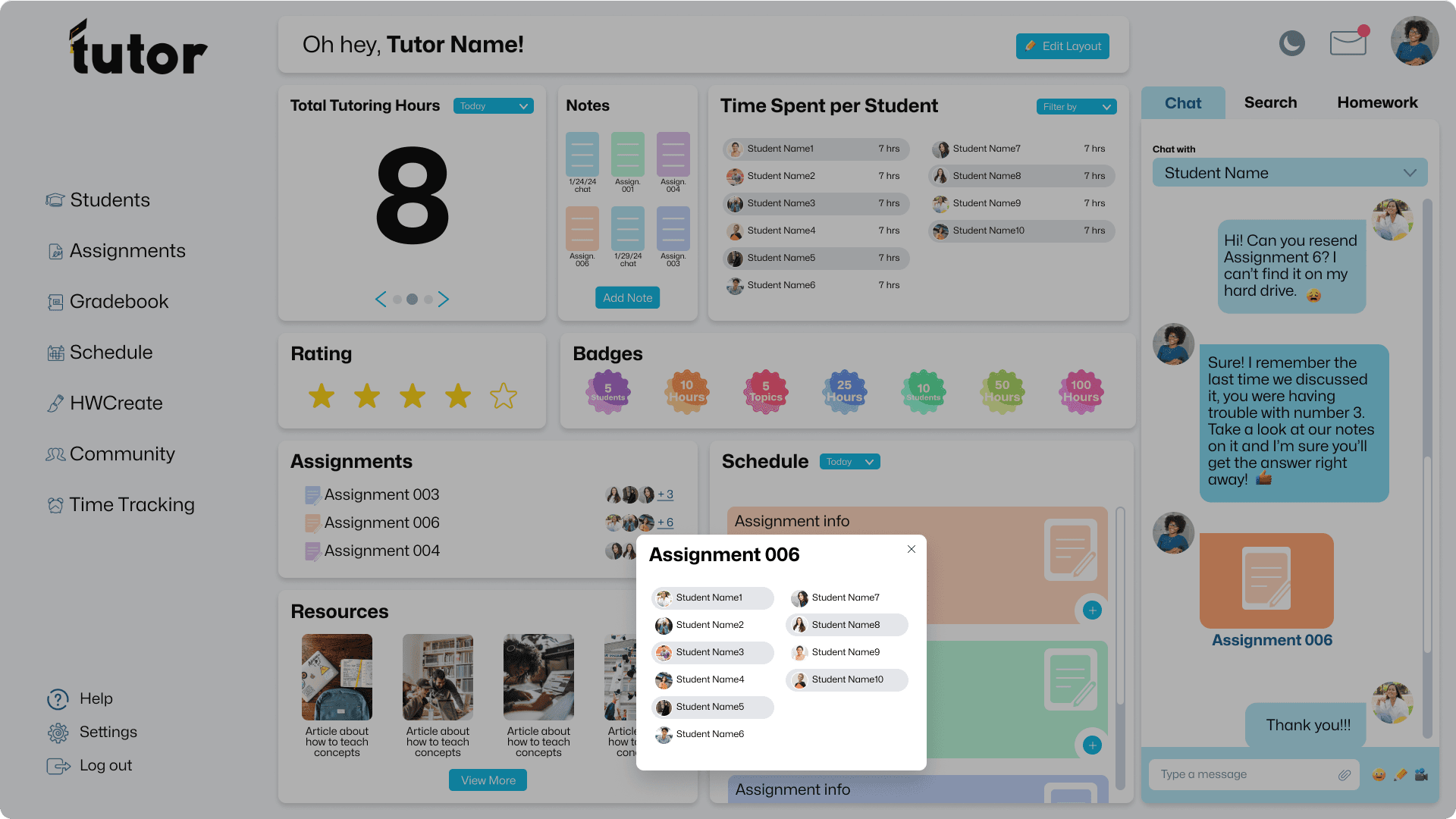
This app was designed to be an all-in-one solution for tutors and students alike. It would feature the ability to easily glance at customizable metrics that may be important to the user as well as focusing on letting the user stay on one screen to do everything they need.
For my interviews, I connected with three experienced mentors and teachers, gathering invaluable insights to shape the features of my tutoring app. Their feedback not only confirmed my initial ideas like note-taking and time tracking but also inspired new elements, such as tracking students' progress on specific concepts. A brilliant suggestion to gamify the experience led to the creation of the Badges section on the Tutor home page. This collaborative process ensures Tutor is tailored to empower both tutors and students on their educational journeys.
